News
Choosing Embroidery Pattern Colors
Color is one of the most powerful tools in embroidery.
It doesn’t just bring a pattern to life—it controls the rhythm of the design, creates movement, builds visual weight, and even evokes emotion.
Whether you’re creating a small hoop art piece or an elaborate tapestry, the colors you choose will determine how your work is seen, felt, and remembered.
Choosing embroidery pattern colors is both an art and a science.
It’s not just about picking your favorite shades; it’s about understanding how colors interact with one another, how they balance within a composition, and how they affect the mood of a finished piece.
Even subtle changes in color can shift the entire tone or direction of your design.
In this blog post, we’ll explore the principles of color selection in embroidery through detailed analysis of various designs from Stitched Stories.
These examples offer insights into how thoughtful color choices lead to stronger visual storytelling, and how even the smallest decision—like using textured stitching in a medium blue instead of a solid red—can have a big impact.
Why Color Matters in Embroidery
Before diving into examples, it’s important to understand why color matters so much in embroidery:
- Color directs attention. Brighter and warmer colors naturally draw the eye, while cooler or muted tones recede into the background.
- Color establishes harmony. Well-chosen color palettes bring unity to a design, even if the subject matter varies.
- Color influences mood. Earth tones can feel calm and grounded. Vibrant colors bring energy. Pastels create a sense of softness or nostalgia.
- Color creates movement. The strategic repetition of certain shades helps guide the viewer’s eye through the composition.
- Color builds contrast. This contrast is key for defining focal points and ensuring readability in text-heavy pieces.
Now let’s look at how these ideas are put into practice through actual embroidered art.

Case Study #1: Mushrooms – Framing the Focal Point
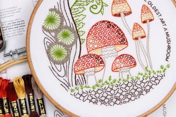
In this piece, the mushroom caps are the undeniable focal point, thanks to a high-energy palette of garnet, orange, and gold.
These colors are bright, warm, and inviting—and they immediately draw the eye.
However, the piece wouldn’t feel complete or balanced without the green and brown tones surrounding the mushrooms.
These earthy hues create a grounded frame that enhances the focal point without competing for attention.
This design teaches an important lesson: surrounding colors matter just as much as the focal color.
Using neutral or low-saturation colors in the background helps the feature elements shine even more brightly.
Takeaway: When you want an element to stand out, surround it with supporting tones that enhance without overwhelming.
Think of the brighter colors as the star performers, and the neutrals as the stage lighting that sets the scene.
Case Study #2: Let Freedom Ring – Visual Weight and Balance
Red and blue are both bold colors, but red carries more visual weight than blue.
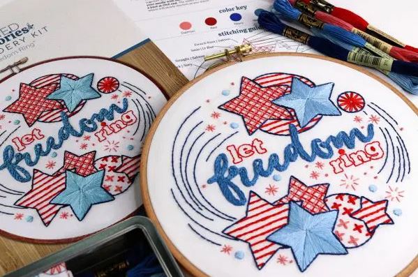
That means it grabs attention faster and more forcefully. In the “Let Freedom Ring” design, red is used thoughtfully—not as a heavy block color, but broken up into stripes, grids, and repetitive motifs.
This diffuses its strength while still giving it presence.

In contrast, solid fills are reserved for lighter blues, which have a gentler pull on the eye.
The word “freedom” is stitched in a thick, textured chain stitch using a medium blue that appears nowhere else in the piece.
This gives the word exceptional visual emphasis without the harshness of red.
The use of navy blue is also critical. It outlines and defines the shapes and provides a structured frame for the design’s circular composition.
Takeaway: Use high-weight colors sparingly, and always think about how to balance them with lighter, softer tones.
Strategic use of color repetition and placement will help maintain harmony and ensure your message isn’t lost in the noise.
Case Study #3: Tree of Life – Contrast and Color Isolation
The Tree of Life design demonstrates the power of contrast and color isolation.
The background is dominated by a flurry of green circles with hints of blue, creating a vibrant but cohesive atmosphere.
However, it’s the birds—stitched in gold and salmon—that become the true focal points.
Why? Because their colors are completely isolated from the rest of the palette. They aren’t echoed anywhere else, and they don’t compete with surrounding elements.
Despite being physically small in size, these birds command attention because they stand out both chromatically and compositionally.
Takeaway: To highlight small elements, use contrasting colors that appear nowhere else in the piece.
The concept of color isolation is particularly effective when working with dense or repetitive backgrounds.

Case Study #4: Moths – Creating Flow with Color Triangles
The “Moths” embroidery design is a perfect example of how to use color to create movement and flow.
Without intentional planning, this piece could easily become chaotic due to the variety of moth species and colors involved.
The central moth uses warm shades—orange, garnet, coral, and gold—which immediately pull focus.

Around it, two triangles of moths help create a visual structure:
- A triangle of grey and coral moths forms a cool, understated balance around the central figure.
- A second triangle of blue and green moths introduces cooler tones into the composition. To maintain unity, small accents of gold and orange are echoed in these moths, connecting them back to the centerpiece.
This layered structure keeps the eye moving and prevents any one area from feeling stagnant.
Takeaway: Repeating accent colors in different zones of your embroidery can unify a busy piece and guide the viewer’s gaze.
Triangular arrangements are particularly effective for creating natural visual flow.

Case Study #5: Mountain Time – Dividing Warm and Cool Zones
The “Mountain Time” design is an exquisite lesson in color zoning.
The composition is split horizontally: the top half features warm tones like garnet, rust, and coral, while the bottom half shifts into greens and muted olives.
To bridge the divide between these zones, two warm-toned elements—a fox and a tent—are placed in the lower half.
These objects echo the colors from the top band and form a visual triangle, subtly stitching the entire composition together.
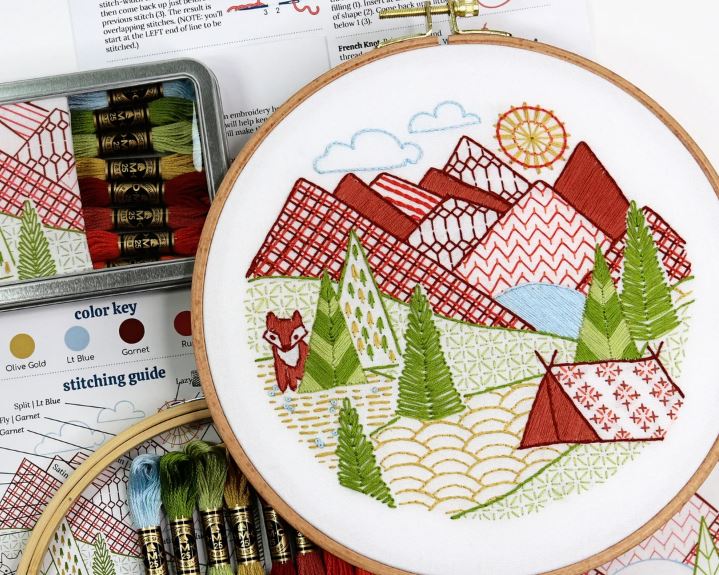
This triangle also performs a practical function: it guides the eye through the cooler section and connects both halves of the piece into a seamless narrative.
Takeaway: Use color strategically to connect different parts of your design.
A single recurring color in key places can build unity and bring coherence to complex or multi-zone compositions.

Case Study #6: Start With Coffee – Color as Structure
Text-heavy designs face a unique challenge: how to maintain clarity and readability while still being decorative.
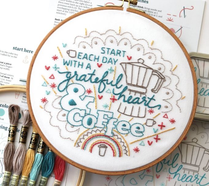
In “Start With Coffee,” this is achieved by stitching the entire quote in a consistent dark turquoise, creating unity across fonts and alignments.
That color is reserved exclusively for the lettering, making the message easy to follow.
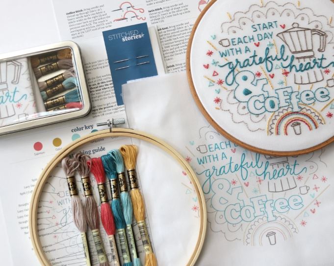
Meanwhile, two shades of driftwood (a soft taupe-like color) build a subtle background featuring a coffee pot and doily.
Gold, red, and light turquoise are introduced in small amounts to lift and balance the piece without overwhelming the typography.
This restrained color palette ensures that the focal point—the quote—remains clear and legible.
Takeaway: In text-based designs, limit your primary colors and avoid visual noise. Use contrast between text and background, and confine accent colors to secondary elements.
Bonus: Tools to Help with Color Selection
If you’re unsure about choosing embroidery colors, several tools can help:
- Color Wheels – These are classic tools for understanding complementary and analogous colors.
- Online Palette Generators – Websites like Coolors.co or Adobe Color help create palettes from photos or themes.
- Embroidery Floss Cards – Brands like DMC offer shade cards that let you see floss colors in real life.
- Mood Boards – Collect fabrics, threads, and inspirations on a board before committing to a palette.
- Nature – Look to gardens, forests, oceans, and skies for natural color harmony.
Final Thoughts: Stitching with Intention
Choosing embroidery pattern colors is more than a technical task—it’s a form of storytelling.
Each shade has the power to evoke emotion, lead the eye, and transform a simple outline into something truly magical.
By studying how colors interact—through contrast, repetition, balance, and placement—crafters can make more confident and expressive choices.
Whether creating a minimalistic modern hoop or an elaborate floral bouquet, understanding how to wield color will elevate every stitch.
So next time you pick up your needle and thread, pause to consider your palette.
With thoughtful choices, your embroidery will not only be beautiful—it will speak with its own unique voice.

